


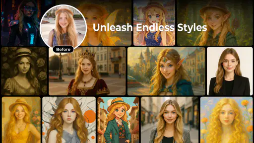
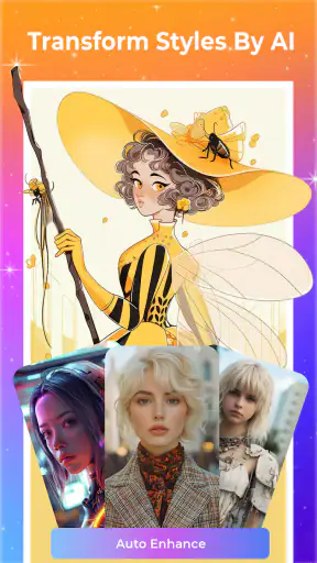
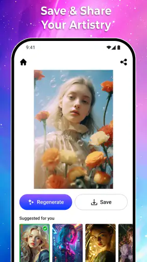
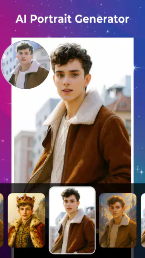
Turning an ordinary photo into something that feels hand-shaped rather than merely filtered is the main reason I would try Artorys: AI Photo Art. This free Art & Design app from 360Control Center - PDPAPP focuses on generating natural-looking AI artwork from pictures, and that narrow purpose gives it a clearer identity than a general photo editor. I found the appeal less in endlessly adjusting sliders and more in seeing how a familiar image changes when the app interprets it as artwork.
That distinction matters. Traditional filters usually apply a visible treatment across the whole image: stronger color, softer edges, a vintage tint or a cartoon-like finish. An AI photo generator attempts something more interpretive. It can change the visual language of the picture, which makes the result feel more like a new illustration than a decorated original. The trade-off is that the output becomes a creative interpretation, not a guaranteed faithful copy of the person, place or object in the source photo.
I see Artorys as a quick creative tool for people who want to explore that transformation without first learning a full desktop art program. It is aimed at everyday experimentation, social profile images, personal projects and visual ideas that need a starting point. It is not the app I would choose when exact editing, professional retouching or precise control is the priority.
What the AI art approach changes in everyday use
A photo becomes a reinterpretation, not just a filter
The most important thing to understand is what you are asking the app to do. When I use a normal editor, I expect the original composition to remain stable. The face should stay recognisable, the background should remain where it was and the small details should respond predictably to my adjustments. With Artorys, the result is more open-ended. The source photo acts as the foundation, while the generated artwork can emphasize mood, texture and style over photographic accuracy.
That makes the app especially interesting with images that already have a clear subject. A portrait, a pet photo, a travel scene or a close-up of an object gives the generator something easy to interpret. A busy image with several people, tiny details and weak lighting is a less comfortable starting point because there are more opportunities for the artistic conversion to lose the original structure.
The useful mindset is to treat each result as a creative draft. I would not judge the app only by whether it preserves every detail. I would ask whether it produces an image I would actually use, share or develop further. That is where the capability has value: it can help someone move from “I have a photo” to “I have an art direction.”
Why the natural-looking goal is important
Many AI image effects are intentionally exaggerated. They add obvious fantasy elements, harsh outlines or a glossy appearance that immediately announces itself as an effect. Artorys is more appealing when the generated image still feels connected to the source. A natural-looking result can work better for a profile picture, a personal gift, a mood board or a visual post because it does not overwhelm the subject.
Natural-looking does not mean invisible. The image can still look clearly artistic, but the transition is more comfortable when the face, pose or central object remains readable. In my experience, this kind of restraint is more useful than an effect that looks impressive for a few seconds but becomes tiring when viewed repeatedly.
There is also a practical advantage for beginners. If the app creates a convincing starting point without requiring manual masking, brushwork or layer management, a person can focus on choosing the right source image rather than learning a complicated workflow. That lowers the barrier to making something personal, even if the final result still needs a second editing step elsewhere.
Where it sits among familiar alternatives
Artorys occupies a middle ground between a one-tap filter app and a full digital art workspace. A conventional filter editor is usually better for predictable corrections: brightness, contrast, cropping and color balance. A drawing app is stronger when you want to paint, erase, layer and control every mark yourself. Artorys is more suitable when you want the application to do much of the visual interpretation for you.
That comparison also explains its main weakness. The less manual control a tool exposes, the less precisely you can correct an unwanted result. If the generated artwork changes a feature you care about, a traditional editor may be the better choice because you can make a targeted adjustment rather than regenerate the whole concept.
I would therefore use Artorys before a conventional editor, not necessarily instead of one. It can create the artistic direction, while another application can handle the final crop, text, layout or small cleanup. That two-step workflow is more realistic than expecting one AI result to be perfect for every purpose.
How I would use it in practice
Start with the photograph, not the effect
The quality of an AI art conversion begins with the source image. I would choose a photo with one clear subject, enough light and a composition that already works on its own. A simple portrait with visible facial features is a stronger test than a distant group shot. A pet facing the camera is easier to interpret than a dark image where the animal blends into the background.
This is one of the less obvious lessons with tools like this: changing the input often improves the result more than repeatedly trying to rescue a weak image. If the subject is partly hidden, heavily blurred or surrounded by visual clutter, the generator has less dependable information to work from. Selecting a cleaner image gives the artistic conversion a better chance of retaining the identity of the scene.
I would also prepare several versions of the same subject rather than relying on a single photograph. A front-facing portrait, a side profile and a wider environmental image can produce very different artistic interpretations. That makes the process feel more like exploring a small collection than applying one permanent treatment.
Use comparison as part of the creative process
One result can be misleading. An image may look striking at first glance but reveal awkward details when viewed more closely. I recommend comparing the generated artwork with the original before deciding whether it works. Look at the eyes, hands, hair, repeated patterns and the edges around the main subject. These areas often determine whether the result feels intentional or merely artificial.
This comparison is useful even when the purpose is not realism. If the goal is a stylised image, changes are acceptable; the question is whether they support the mood. A distorted hand might be harmless in an abstract composition but distracting in a portrait intended as a gift. The right result depends on the use case, not on a universal idea of perfection.
A practical workflow is to keep the original untouched, generate an artistic version, then make the final decision outside the creative experiment. That separation prevents a visually exciting output from replacing the source image before you have checked whether it actually serves your purpose.
Think about the final destination early
The same artwork can work differently depending on where it will appear. For a profile image, a face that remains readable at a small size matters more than subtle background detail. For a printed card, the composition and empty space may matter more. For a personal gallery, unusual texture or a more dramatic transformation may be welcome.
That is why I would avoid choosing an effect solely because it looks impressive in the app preview. Imagine the image at its final size and shape. If the subject becomes too small, if the strongest detail sits at the edge or if the artwork depends on fine texture that disappears on a phone screen, the result may not be as useful as it first appears.
Artorys is most effective when I decide what the image is meant to communicate before generating it. “Make this feel warmer,” “turn this memory into something illustrative” and “create a personal visual for a post” are more useful intentions than simply asking for the most dramatic transformation available.
A realistic everyday scenario
Creating a personal image from a phone portrait
Imagine taking a casual portrait of a friend during a weekend walk. The photo is pleasant but ordinary: the lighting is acceptable, the background is a little distracting and the image does not feel special enough to print or share as a creative post. This is the kind of situation where I would open Artorys.
I would first choose the clearest portrait from the camera roll, preferably one where the face is not covered and the subject is separated from the background. After generating an artistic version, I would compare it with the original at a smaller display size. If the face remains recognisable and the background becomes less distracting, the result could work as a personal profile image or a small gift design.
If the first output changed the expression too much or made the background compete with the subject, I would not immediately blame the app. I would try a different source photo with a simpler composition. That is a more sensible adjustment than expecting the generator to reconstruct information that was never clear in the original.
The final step would be modest. I might use a separate editor to crop the image, add a border or place it into a card layout. Artorys would provide the creative transformation, while the other tool would provide the presentation control. This is a good example of where the app can save time without pretending to replace every part of a design workflow.
Turning a familiar object into a visual idea
The same approach can work with an object rather than a person. A handmade item, a favourite instrument, a bicycle or a plant can become a starting point for an illustration. This is useful for someone building a mood board, planning a small craft project or simply looking for a fresh way to view something familiar.
Objects with a clear outline are especially practical because the app has an obvious subject to interpret. A cluttered desk may produce a less focused image, while a single object photographed against a simple background gives the artistic conversion a stronger centre. This is another reason I would compose the source deliberately instead of treating any random camera image as equally suitable.
Where the convenience comes with trade-offs
Creative control is limited by the one-step approach
The biggest compromise is control. Artorys is attractive because it handles a complex visual transformation quickly, but that convenience means I cannot expect the same precision as a layer-based editor or drawing application. When a result is almost right, the missing ability to correct one small area can become frustrating.
This matters most for portraits and images with meaningful details. If the shape of a person’s face, the design on a piece of clothing or the lettering on an object is important, an AI interpretation may alter it in ways that are visually interesting but factually wrong. For those jobs, I would keep the original and use a more controlled editor for the final version.
Results can be inconsistent from image to image
AI-generated artwork is not always predictable. Two source photos of the same subject can lead to noticeably different outcomes because composition, lighting and visible detail influence the interpretation. That unpredictability is part of the creative appeal, but it also means the app may require selection rather than a single tap and done approach.
For a casual user, this may be a minor inconvenience. For someone working to a strict visual brief, it can be a serious limitation. If you need the same person, object or brand element to appear consistently across a series, a manual design tool or a more controlled generation workflow would be safer.
Privacy and originality deserve common sense
Whenever I use an AI art app with personal photographs, I think carefully about the images I choose. I would avoid testing the tool with sensitive documents, private identification images or photographs containing information I would not want to process through a creative service. That is sensible practice for any photo-based application, especially one that transforms images rather than merely displaying them.
I would also be careful with commercial use. An attractive generated portrait may be fine for a personal post, but a business identity, product campaign or paid design requires more certainty about consistency and rights than a quick artistic experiment can provide. Artorys is better suited to personal creativity unless the user has separately checked the requirements surrounding the final work.
Device expectations and access
The app supports devices running Android 8.0 or later, which makes it accessible to people using older Android hardware as well as newer phones. Even so, AI image creation can feel more demanding than ordinary cropping or filter adjustments. I would keep the phone charged, use a stable connection when needed and be patient if a generation takes longer than a basic edit.
Artorys is free, which makes experimentation easier because trying the app does not require an upfront purchase. That is helpful for curious users who want to decide whether AI art fits their workflow before spending money on a larger creative suite. Free access does not remove the need to evaluate the results carefully, but it lowers the risk of simply exploring the idea.
Who will get the most from Artorys?
A strong fit for casual creators and visual experimenters
I would recommend Artorys to someone who enjoys taking photos but does not want to learn complex digital painting software. It is also a good match for users who want a quick way to make a personal image feel more distinctive, especially when the goal is inspiration rather than technical perfection.
People creating social posts, profile images, digital invitations or personal mood boards may find the AI conversion useful. The app can turn a familiar photograph into a visual variation that feels more deliberate, even when the user has limited design experience. Its Everyone content rating also makes it approachable for a broad audience, although adults should still guide younger users in choosing appropriate images and sharing them responsibly.
The app has already attracted a substantial audience, with over five million installs and an average rating of 4.5 from around five thousand ratings. Those figures suggest that the basic idea resonates with many users, but they should not replace personal testing. AI art is subjective, and the same transformation that feels creative to one person may feel too unpredictable to another.
Less suitable for professional precision
I would skip Artorys as the main tool for detailed retouching, exact branding, technical illustration or artwork that must preserve every source element. A professional designer may enjoy it as an idea generator, but the final work would likely need a more controlled application. The same applies to anyone who dislikes unexpected changes and wants every visible mark to be chosen manually.
It is also not the best choice if your main goal is ordinary photo improvement. If you only want to correct exposure, remove a small distraction or straighten a picture, a standard photo editor will usually be faster and more predictable. Artorys earns its place when the desired outcome is a new artistic interpretation, not a cleaner version of the same photograph.
My recommendation after using the concept as intended
Artorys: AI Photo Art, currently at version 1.1.2, is most convincing when treated as a source of visual possibilities. I like the idea of handing it a clear, meaningful photo and seeing whether it can turn that memory into something with an illustrative character. The free entry point and broad device support make it easy to try, while the art-focused purpose keeps the experience more focused than a crowded all-in-one editor.
My advice is to begin with simple subjects, compare every result with the original and keep a separate editor available for cropping or finishing. Do not use it when exact identity, text or product detail must remain untouched. Choose it for creative reinterpretation, not precision correction.
For the right user, that is enough to make it worthwhile. It can provide a fresh visual direction in moments and help a beginner explore AI-assisted art without committing to a complicated design workflow. For users who need predictable, repeatable and fully manual results, a conventional editor remains the better option. In my view, Artorys succeeds when it is used as a playful creative step between taking a photo and deciding what that photo could become.


